
新しいグローバルメニューを考えたい。その2
先日ブログで書いた、メニューバーの代替案を考えてみました。
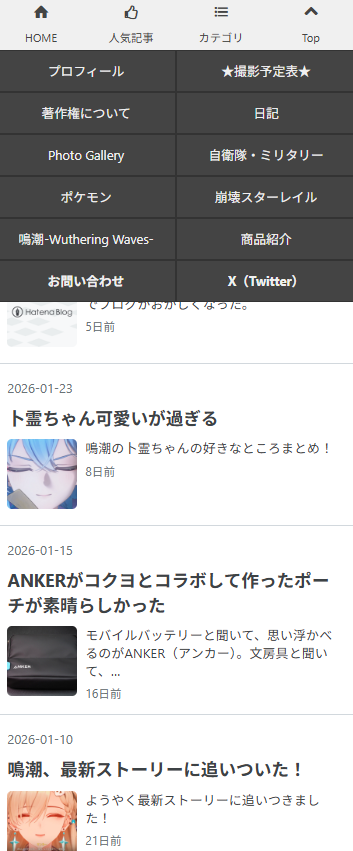
案その1
▶CSS(クリックで表示)
<!--固定メニューバー-->
<div id="menu">
<div class="toggle-contents">
<div class="toggle-content">
<div class="hatena-module hatena-module-entries-access-ranking"
data-count="5"
data-display_entry_category="0"
data-display_entry_image="1"
data-display_entry_image_size_width="50"
data-display_entry_image_size_height="50"
data-display_entry_body_length="0"
data-display_entry_date="0"
data-display_bookmark_count="0"
data-source="access"
>
<div class="hatena-module-body">
</div>
</div>
</div><!--toggle-content-->
<div class="toggle-content">
<ul class="category-list">
<li><a href='url'>カテゴリ1</a></li>
<li><a href='url'>カテゴリ2</a></li>
<li><a href='url'>カテゴリ3</a></li>
<li><a href='url'>カテゴリ4</a></li>
<li><a href='url'>カテゴリ5</a></li>
<li><a href='url'>カテゴリ6</a></li>
<li><a href='url'>カテゴリ7</a></li>
<li><a href='url'>カテゴリ8</a></li>
</div><!--btn-area-->
<div style="clear: both;"></div>
</div>
<style type="text/css">
#menu{
position: fixed;
bottom: 0;
left: 0;
width: 100%;
height: 50px;
z-index: 10;
}
.toggle-content{
display: none;
position: fixed;
bottom: 50px;
background: white;
width: 100%;
}
.toggle-content .hatena-module{
padding: 15px 10px 10px 10px;
}
.toggle-content .hatena-module-body{
font-size: 80%;
}
.toggle-content .hatena-module-body a{
color: #444;
font-weight: bold;
}
.toggle-content .hatena-module-body .urllist-image{
width: 50px;
height: 50px;
}
.toggle-content .urllist-item{
padding: 0;
margin: 0;
min-height: 29px;
}
.toggle-content .urllist-item::before{
display: none;
}
.category-list{
list-style-type: none;
margin: 0;
width: 100%;
padding-left: 0;
}
.category-list a{
display: block;
float: left;
width: calc(50% - 2px);
height: 40px;
line-height: 40px;
text-align: center;
background: #444;/*カテゴリの背景色*/
color: #f0f0f0;/*カテゴリの文字色*/
font-size: 80%;
border: 1px solid #333;/*カテゴリリスト間の線の色*/
}
.btn-area a,
.btn-area span{
display: block;
float: left;
width: 25%;
height: 50px;
line-height: 25px;
text-align: center;
font-size: 70%;
background: #f0f0f0;/*メニュー部分の背景色*/
color: #444;/*メニュー部分の文字色*/
}
</style>
<script type="text/javascript" src="http://code.jquery.com/jquery-1.9.1.min.js"></script>
<script>
$(function(){
var contentArea = $(".toggle-content");
$(".toggle-btn").click(function(){
var index = $(this).index()-1;
var clickedArea = $(contentArea).eq(index);
if($(clickedArea).css('display') !='none'){
$(contentArea).slideUp();
}else{
$(contentArea).slideUp();
$(clickedArea).slideDown();
};
});
$(".back-btn").click(function(){
$("html,body").animate({scrollTop:0},"fast");
});
});
</script>
コード内の"bottom"を"top"に変更。
メニューバーが下部から上部へ移動します。
これで前回書いた「メニューバーが消えるバグ」が解消されます。
ですが、これはこれでちょっと見にくいかも。
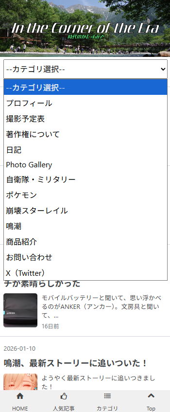
案その2
▶CSS(クリックで表示)
<div class="menu-puldown">
<form method="post"><select onchange="navi(this)">
<option value="">--カテゴリ選択--</option>
<option value="URL">カテゴリ1</option>
<option value="URL">カテゴリ2</option>
<option value="URL">カテゴリ3</option>
<option value="URL">カテゴリ4</option>
<option value="URL">カテゴリ5</option>
</select></div>
いっそのこと、カテゴリのメニューバーを新しく設置。
これはこれでありかも。まぁ、「投稿しました」のポストから飛ばなければ起きないバグなので、気にしすぎなのかもしれませんが。
※プロフィールに貼ってあるリンクから見れば問題ないです。
ひとまず、「現行のメニューバーをそのままにして、案その2も導入する」ことにしてみます。
この記事を書いた人のX(Twitter)

